To go along with my maps and analysis of New Jersey’s 2015 State Assembly elections, I’ve created a bunch of cool graphs in R that further illustrate some of the patterns and trends that I discussed previously.
This first graph compares the Democrats’ performance in the 2015 state Assembly races to Obama’s performance in 2012.
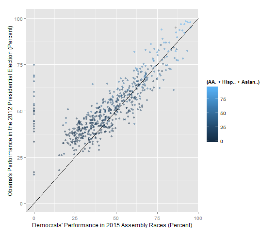
As you would expect, there’s a clear positive correlation. However, some things to notice are:
1) There are clearly more data points (i.e. municipalities) above the 1-1 line than below it. This visualizes that there were significantly more municipalities where Obama outperformed the Assembly Democrats than where the Assembly Democrats outperformed Obama.
2) The line of data points where Assembly Democrats received zero percent are the municipalities in LD-8, whose election the Democrats did not contest and thus featured only Republicans.
3) The color of each data point indicates the percentage of each municipality’s population that is African-American, Hispanic, or Asian. Almost all of the data points in the upper right-hand portion of the graph, indicating municipalities where both Obama and the Assembly Dems performed extremely well, are colored light blue, indicating that they have large minority populations. By contrast, almost all of the date points where both Obama and the Assembly Dems performed poorly have a very dark color, indicating that those municipalities are almost entirely white. While this should not come as a surprise, it is nonetheless meaningful to see the pattern visualized.
The next graph compares the Democrats’ performance in the 2015 state Assembly races to each municipality’s voter turnout as a percentage of registered voters.
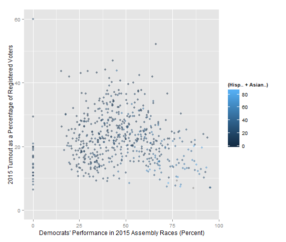
While no pattern is immediately evident, a closer look reveals several interesting trends.
1) The color of each data point on this graph indicates the percentage of each municipality’s population that is either Hispanic or Asian (not African-American, since African-American turnout is higher than that of Hispanics or Asians). While we’ve already established in the previous graph that municipalities with large minority populations are generally heavily Democratic, this graph shows that municipalities with large Hispanic and/or Asian populations almost invariably have low voter turnout. Almost all of the light-colored data points are located in the lower-right corner of the graph. However, the municipalities with low Hispanic and Asian populations don’t appear to have any related pattern.
2) If you look closely at the graph, you will notice that among municipalities whose turnout was between 10 and 15 percent, there is a large cluster of them where Democrats received between 25 and 50 percent, and then another cluster where Democrats received over 60 percent. But strangely, there seems to be a small hole in the graph, a lack of municipalities, for which Democrats received between 50 and 60 percent and turnout was between 10 and 15 percent. Why could this be? One hypothesis is that these are the municipalities where Democrats put in the extra effort in order to win (for either local or Assembly elections), and thus that effort increased the voter turnout in those municipalities.
3) One more (rather depressing) note about this graph: only two municipalities in the entire state, out of 566, saw voter turnout over 50 percent, and both of these municipalities have fewer than 300 people. Clearly New Jersey can do a lot more to increase turnout for these elections. (For those who are curious, those two municipalities with turnout greater than 50 percent are Cape May Point and Pine Valley.)
This third graph compares the Democrats’ performance in the 2015 state Assembly races to the area, in square miles, of each municipality.
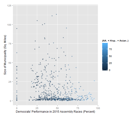
Some thoughts about this graph:
1) The first thing that probably popped into your mind when you saw this graph is that the vast majority of New Jersey municipalities are tiny, fewer than 10 square miles. Part of this is due to New Jersey’s system of municipal organization. A very common type of municipality in New Jersey is the borough, which generally uses the compact populated place model of municipal organization rather than the New England Town model, thus resulting in most boroughs being very small in area. All of the larger municipalities, on the other hand, are townships. As it happens, there’s not much of a correlation between a municipality being a borough or a township and how it votes in elections (I’ve made a box plot in R that shows this).
2) There seems to be a slight correlation between the area of a municipality and how it voted in the 2015 State Assembly elections. However, this correlation only appears to exist in municipalities that voted over 75 percent for the Democrats in 2015. Of those municipalities, all but one are fewer than 25 square miles, and of the eleven municipalities that gave the Democrats over 87.5 percent in 2015, ten are fewer than 12 square miles. It shouldn’t be a huge surprise by now that many of these small, heavily Democratic municipalities are represented by light blue data points on the graph, indicating that they have large minority populations.
The final graph compares the Democrats’ performance in the 2015 state Assembly races to the difference between the Assembly Dems’ 2015 performance and Obama’s 2012 performance. On the y-axis, a positive number means that Obama outperformed the Assembly Democrats, while a negative number means that the Assembly Dems outperformed Obama.
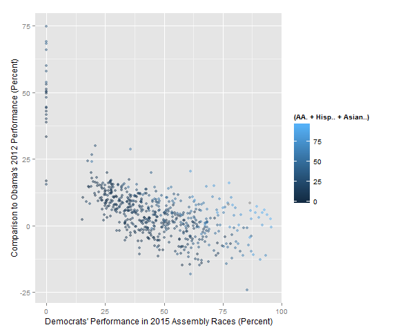
Some thoughts about this graph:
1) There is clearly a correlation between these two variables. The graph shows that municipalities where Assembly Democrats performed worse in 2015 are more likely to have seen substantial drops in Democratic performance from 2012 to 2015, while municipalities where Assembly Democrats performed well in 2015 are more likely to be places where the Assembly Democrats outperformed Obama.
2) However, municipalities where Democrats received less than 30 percent in 2015 almost unanimously saw Obama outperform the Assembly Democrats, while among municipalities where Democrats received over 75 percent in 2015, some saw Obama outperform the Assembly Democrats while others saw the Assembly Democrats outperform Obama. Thus, the situations on the left and right sides of the graph are not the same.
3) Despite the patterns mentioned above, among the most heavily Democratic municipalities, most of them did not see improvements in Democratic performance from 2012 to 2015. In a majority of them, Obama actually did better than the ’15 Assembly Dems. One explanation for this is that these municipalities are all colored light blue on the graph, and thus have large minority populations. The turnout woes among minorities that have been discussed previously may explain why these heavily Democratic municipalities nonetheless saw Obama outperform the 2015 Assembly Democrats.
Feel free to comment, and you can contact me at ghnaigles@gmail.com.
