In 2014, Cory Booker won re-election to his first full term in his New Jersey Senate seat by a 56-42 margin, defeating Republican Jeff Bell. Just slightly over a year earlier, he had won an October 2013 special election to finish the term of the late Frank Lautenberg by a 55-44 margin over Republican Steve Lonegan. Both of these margins of victory are about average for Democrats in New Jersey, since no Democrat has either received over 60 percent in a statewide election, or lost to someone other than Chris Christie, for over a decade. And sure enough, Booker’s electoral map in 2014 looks very similar to those of most statewide Democrats, with a few interesting differences (click on the maps to enlarge).

To get a better idea of how Booker’s performance differed from those of other Democrats, here is a map comparing Booker’s 2014 performance to Obama’s 2012 performance:
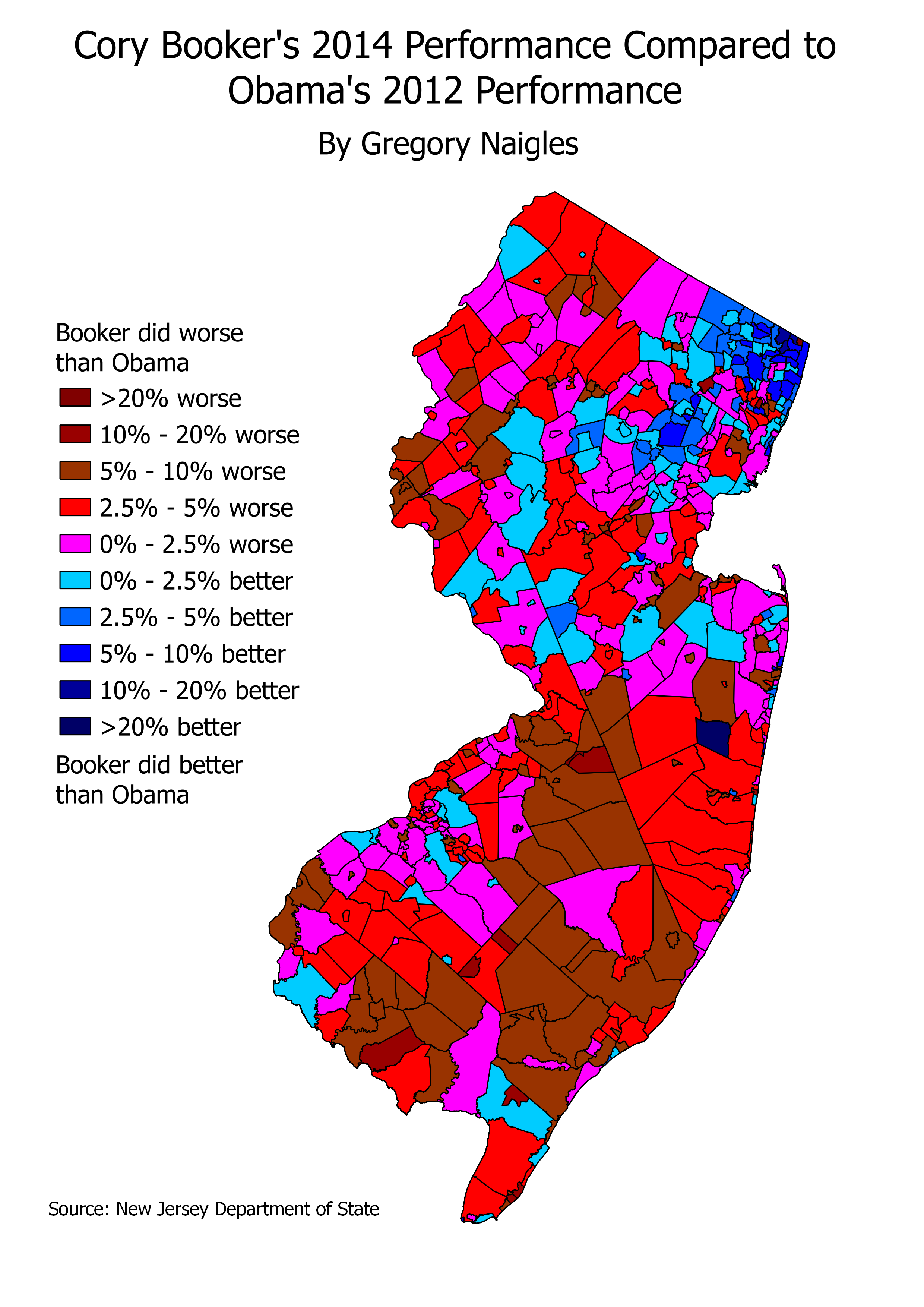
As the map shows, Booker generally underperformed Obama in South Jersey, in cities, suburbs, and rural areas. This is not too surprising, considering that Booker, as the former mayor of Newark, is strongly associated with North Jersey, and politicians from one end of New Jersey are frequently less popular in the areas at the other end. Booker also underperformed Obama overall in Central Jersey, but by small margins than in South Jersey. And Booker overperformed Obama in most areas of North Jersey, in particular Bergen County. Booker was raised in Bergen County, in the small town of Harrington Park, so he definitely got a hometown boost there. Interestingly, he did not get a hometown boost in Newark itself. This is possibly because 1) Booker was popular, but not enormously so, as mayor of Newark, and 2) Newark, like most cities in New Jersey, is particularly susceptible to midterm dropoff, which disproportionately hurts Democrats. However, Booker did do better than Obama in many of the other towns in Essex County.
Finally, I compared Booker’s 2014 performance to his performance a year earlier in the special election.

This map is interesting, but doesn’t show a huge number of patterns. If anything, it shows that Booker’s performance in his two elections was generally quite similar in most areas of the state. He did improve significantly in Salem and Cumberland Counties, in South Jersey, where he substantially underperformed in 2013. This is probably due to normally-Democratic voters coming home in the end.
One final very interesting note is visible on both of the maps above. The township of Lakewood, in Ocean County, is colored dark blue on both maps. This means that not only did Booker improve dramatically in 2014 from Obama’s 2012 performance, he also improved dramatically from his own performance a year earlier. And this improvement is pretty massive: about 30 percent both times. What could cause this? Lakewood essentially has two major voting demographics: a larger (and fast-growing) community of Orthodox Hasidic Jews, and a smaller community of retirees. The retiree community always votes the same way, and that’s about 65-35 for any Republican. However, the Hasidic Jews vote as a bloc and can vote for either party. In both the 2012 presidential and 2013 senatorial elections, the Hasidic Jews voted en masse for the Republican, thus resulting in Lakewood voting over 70 percent for the Republican in both elections. However, in the 2014 Senate election, the Hasidic community swung its votes to Booker, resulting in Booker actually winning Lakewood with about 56 percent of the vote. These sorts of wild swings in Hasidic communities are not unprecedented – similar communities in NYC and its suburbs show similar patterns.
Thus, Booker’s home region did play a role in his winning coalition, but it was largely New Jersey’s strong Democratic base, and voters who vote for any Democrat, that allowed Booker to easily win a full term.
