The 2017 U.S. Senate special election in Alabama was a political earthquake in more ways than one. Not only did a Democrat win a statewide election in Alabama for the first time since 2008, and a U.S. Senate election for the first time since 1992, but Democrat Doug Jones’ victory in Alabama used a coalition that had never before successfully produced a victory. No Democrat (or Republican, for that matter) had ever before won Alabama using a coalition of urbanites, suburban voters, college towns, and rural African-Americans. All previous winning Democratic coalitions in Alabama had relied heavily on rural white voters, however Jones’ coalition most emphatically did not rely on them.
But what did this coalition look like in Jefferson County, the most populous county in Alabama and home to Birmingham? Jones won Jefferson County with 68 percent of the vote, an almost unheard-of performance for a Democrat. In fact, the only other recent election where a Democrat received even close to that level of support in Jefferson County was the 2012 Alabama Supreme Court Election, where, not coincidentally, Roy Moore was also the Republican candidate. But Roy Moore won that race statewide. Jefferson County offers some clues to why he did not win the 2017 election, and a potential route forward for Democrats in this very red state.
Over the course of my analysis, I have found that there are three types of precincts in Jefferson County. These three types are differentiated by geography, racial demographics, income levels, and voting patterns. These groups can easily be seen on all of the graphs that I present below.
The first category of precincts consists of heavily African-American precincts in the central part of the county, centered in Birmingham and stretching southwest to Bessemer and northeast to Center Point. These precincts are generally poorer and very heavily Democratic.
The second category of precincts lies to the southeast of Category 1, consisting mostly of the cities of Homewood, Vestavia Hills, and Mountain Brook. These precincts are much whiter and richer than those of Category 1, and are generally heavily Republican. However, in special cases (and by “in special cases” I mean when the Republican candidate is Roy Moore), they are much more open to voting for Democrats. These precincts mostly voted against Moore in his 2012 election, and as we will see below, they did so again in 2017.
The third category of precincts consists of the mostly-white suburbs to the north and west of Birmingham, including Trussville, Gardendale, Mount Olive, and Sylvan Springs. These precincts are similar in racial demographics to those of Category 2, but they are less wealthy. They are also heavily Republican, and unlike the precincts in Category 2 did not swing heavily against Roy Moore in 2012.
The graph below compares Jones’ performance in each precinct to Hillary Clinton’s performance in the 2016 Presidential election.
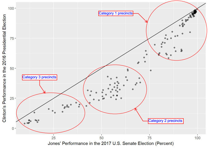
You may recall that in the 2012 Alabama Supreme Court election, Bob Vance (the Democratic candidate) significantly outperformed Barack Obama in the white suburban areas, but actually underperformed Obama by a few percent in the mostly African-American precincts. In the run-up to the 2017 election, I was curious to see whether or not this would happen again, considering that 1) there was no African-American candidate at the top of the ballot to boost black turnout, but 2) the Jones campaign focused heavily on convincing African-Americans to vote for him. As the graph shows, those efforts paid off handsomely – Jones outperformed Hillary Clinton in every single precinct in Jefferson County, including the heavily African-American ones.
We can also see the differences between the three categories of precincts. The Category 1 precincts voted heavily for both Clinton and Jones. The Category 2 precincts all voted for Trump in 2016, but then the vast majority of them swung over to support Jones in 2017, often by wide margins. The Category 3 precincts also voted heavily for Trump in 2016, but in contrast to the Category 2 precincts, did not swing over to support Jones; in fact, Jones, while moderately improving on Clinton’s performance, still didn’t even crack 40 percent in any Category 3 precincts.
This next graph compares Jones’ percentage of the vote with the voter turnout as a percentage of the 2016 turnout.

Immediately after the election, much was made of the observation that African-American turnout was noticeably higher than white turnout. But there’s more to the story than just that. As the graph shows, the Category 1 precincts, which are mostly African-American, saw relatively high turnout, averaging about 80 percent of the 2016 turnout. But looking at turnout in this way also reveals an important difference between the white voters in Category 2 precincts and those in Category 3 precincts. Turnout in Category 2 precincts was also fairly high – averaging between 70 and 75 percent of 2016 turnout. While certainly not as high as the Category 1 precincts, that is really not a substantial difference, and if white turnout all across Alabama was that high, then Roy Moore would probably have won. But it wasn’t, and that is shown by the Category 3 precincts. They saw substantially lower turnout than the Category 1 and Category 2 precincts, averaging only about 60 percent of 2016 turnout. And remember, those are the precincts that are not only heavily Republican but stayed with Moore in 2017. Thus, Doug Jones basically got the best-case scenario in terms of turnout – heavily-Democratic African-American precincts had very good turnout, white suburban precincts that voted for him also saw fairly good turnout, and white suburban and rural precincts that voted heavily against him saw much lower turnout. It is therefore clear that these turnout patterns were a significant contributor to Jones’ win.
This next graph compares Jones’ percentage of the vote with the difference between Jones’ and Clinton’s performances in the 2017 and 2016 elections respectively.

This graph emphasizes the differences between Category 2 and Category 3, that not all white suburban precincts in Jefferson County have similar voting patterns. In order to vote for Jones, the Category 2 precincts, which are normally very Republican, had to swing heavily to the left, and that they did, since with them we see a large difference between Jones’ and Clinton’s performances. However, not only did the precincts in Category 3 start out very heavily Republican (even more so than those of Category 2), but they also swung substantially less toward Jones than the precincts of Category 2 did. This is largely to do with the differing levels of educational achievement between the two categories. As we have seen in many recent elections, including the 2016 presidential election, a higher level of educational achievement makes voters more likely to support Democrats, and a lower level of educational achievement makes voters more likely to support Republicans. Since the precincts of Category 2 have a much higher level of educational achievement than those of Category 3, it should be no surprise that the precincts of Category 2 swung Democratic by a significantly larger margin than those of Category 3. The Category 1 precincts mostly saw very small swings toward Jones largely because they already voted heavily Democratic, so there wasn’t much more they could swing toward the Democrats. Thus, the relationship between Jones’ performance and the difference between Jones’ and Clinton’s performances isn’t linear – the relationship looks more like an upside-down V, with both deep-blue and less-educated deep-red precincts having comparatively small swings toward Jones, and well-educated white suburban precincts swinging heavily toward Jones.
My final graph compares the percentage of vote cast that consisted of write-ins with the difference between Jones’ and Clinton’s performances. The color of each point reflects the percentage of the vote that Jones received in each precinct.
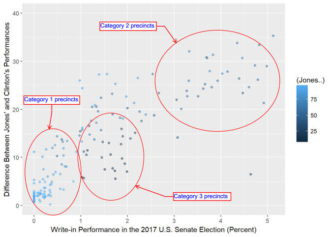
This is a very interesting and revealing graph, for several reasons. First, it is the only graph in this set where the Category 1 and Category 3 precincts are closer to each other than to the Category 2 precincts. It goes to show that the Category 1 and Category 3 precincts are actually in some ways similar to each other. The precincts in both categories are very polarized, contain few swing voters, and seemed generally satisfied enough with the candidates that they did not feel the need to write in anyone. Now, it should be no surprise that the heavily Jones-supporting precincts of Category 1 saw the fewest write-in votes, since those people were generally very happy and excited to vote for Jones. But the precincts of Category 3, which heavily supported Roy Moore (as shown on the graph – note that they are colored black), only saw slightly more write-in votes cast than the precincts of Category 1.
However, the wealthy white suburban precincts of Category 2 saw substantially more write-in votes than either Category 1 or Category 3. These are people who normally vote Republican, but absolutely hate Roy Moore (and have for a long time – they didn’t vote for him in 2012 either), but yet couldn’t bring themselves to vote for a Democrat. One of the write-in ballots from this area read “A Normal Republican, Please”, and that is likely the sentiment of most of the voters in Category 2 precincts who cast write-in votes. They wanted to vote for a Republican, but simply could not bring themselves to vote for Roy Moore.
Interestingly, this pattern of wealthy white suburbs casting a larger-than-average share of write-in votes (or other protest votes) has been seen before, in the 2016 presidential election. In that election, Libertarian Gary Johnson performed substantially better in well-educated suburbs than in either minority-heavy cities or mostly-white rural areas. These write-in ballots from the well-educated suburbs of Birmingham are a continuation of that trend. It will be interesting to see if this trend continues in future elections with extremely controversial Republican candidates like Roy Moore or Donald Trump.
What does this election mean for the future of Alabama? Not as much as most people will tell you. Despite the result of the 2017 U.S. Senate election, Alabama remains a very red state, and Jones’ coalition and the circumstances of his victory are unlikely to be replicated in any other election where the Republican candidate is someone other than Roy Moore. But the results should give Democrats hope that they can make inroads in one particular area. As we have seen, the precincts of Category 1 already vote heavily Democratic, and the precincts of Category 3 are inflexibly Republican. However, Democrats should make a serious effort to attempt to consolidate their strong performance in the precincts of Category 2. Elsewhere across the country, well-educated white suburbs are swinging toward the Democrats, and if Alabama Democrats reach out to and invest in those areas, they may be able to get them to vote Democratic even in cases where the Republican candidate isn’t Roy Moore.
